
Latency monitoring with Seq 4 preview
There’s a new Seq preview build out for you to try! This post is a quick introduction to some of the new dashboarding functionality you’ll find in there.
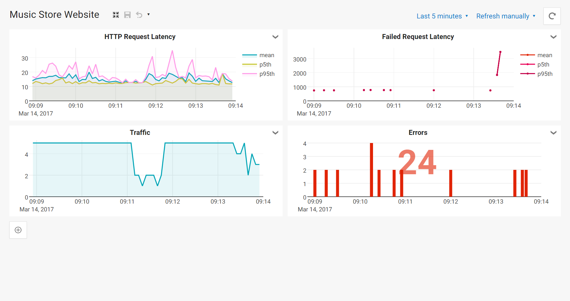
Google’s recent Site Reliability Engineering book suggests that four “golden signals” should form the basis of any monitoring regime. They are: latency, traffic, errors and saturation.
Latency, the topic of this post, is:
The time it takes to service a request
Latency is interesting to watch because it’s a leading indicator for other problems. If latencies start to rise, you can be pretty sure that there’s some kind of resource exhaustion or other failure following close behind. The goal of monitoring in general is to put you one step ahead of problems, so that you can avoid or lessen their impact. Seq 4 aims to make it easy to track indicators like this through dashboarding.
What follows are step-by-step instructions for creating a dashboard like the one above. Grab the 4.0 preview installer from the Seq download page and install it on a non-mission-critical to get started.
1. Collect latency data
If the latency you’re tracking is HTTP response time, collecting it is usually straightforward. ASP.NET Core already records request timings out-of-the box, for example.
The great thing about hooking into log though, is that you can time practically anything that’s important to your app. There’s a helper library called SerilogTimings that makes this easy, but any event with timing data attached will do:
var sw = Stopwatch.StartNew();
handler.Handle(message);
Log.Information("Message {MessageType} handled in {Elapsed} ms", msgType, sw.ElapsedMilliseconds);
(Some things you might measure: transaction commit time, message handler completion time, external API response time, batch completion time, startup time, query response time…)
There’s a leaner and more focused HTTP request logging middleware example for ASP.NET Core on the Seq blog. Since it’s familiar territory, that’s what I’ll use in the remainder of this post. It produces events like these when requests are processed:
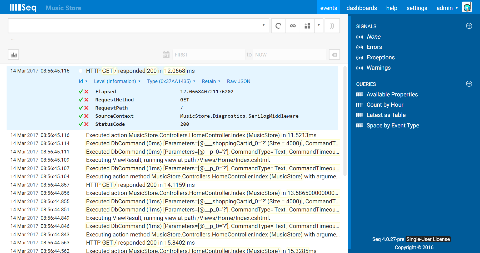
The app is the Music Store sample from ASP.NET.
2. Isolate HTTP requests
The first step is to filter the log to show only the events we’re interested in. The HTTP request events are going to be mixed in with all sorts of other data produced by the app.
The request logging middleware we’re using is designed carefully so that every event is produced using the same message template, and hence has the same event type in Seq. Using Event type > Find in the event details will do all the filtering we need.
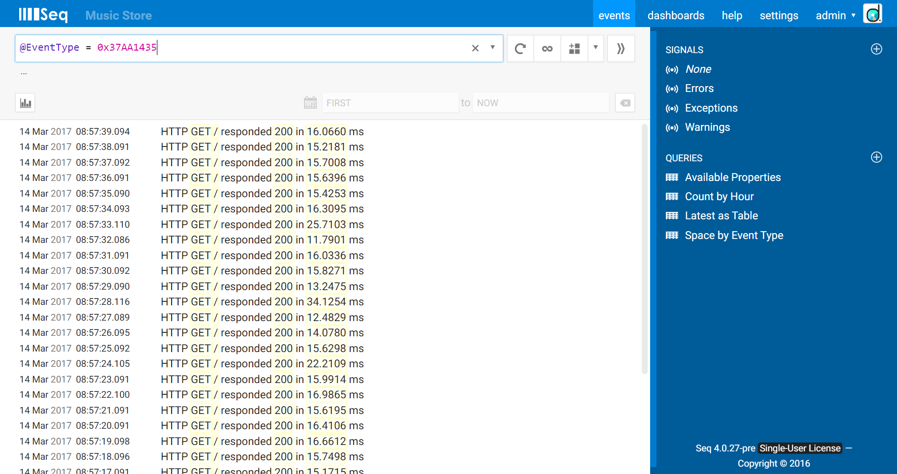
The >> “move to signal” button lets us create a new signal based on that, which we’ll call “HTTP Requests”.
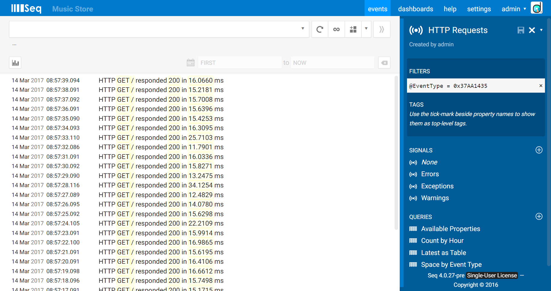
Once the signal is saved, we can come back and apply it any time we want to zoom in on HTTP request handling.
3. Define latency measurements
If your site or API only gets a few visits, you can look at each individual request. Most of the time, however, you’ll need to pick some kind of average values to monitor.
The mean latency is interesting, because it takes all requests into account, and thus any general trend should be reflected in some kind of change to the mean. It’s calculated as sum(Elapsed)/count(*). Seq has a built-in function mean() that you can use to compute this:
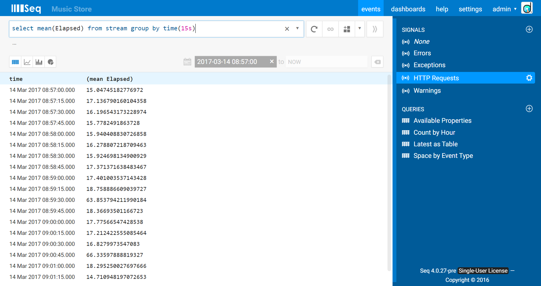
(It’s worth pointing out that the property doesn’t have to be called Elapsed for this to work - you can give your timing values whatever name you choose.)
The default view for query results is a table. Since this result is a timeseries, the little “timeseries chart” icon will show the results graphically:

The mean isn’t the only game in town, however. Averaged over many requests, abnormally slow - or quick - timings can be masked. To address this, it’s often useful to track a number of percentiles. Roughly speaking, a percentile n is the timing below which n% of the values fall. The 95th percentile, therefore, is going to tell you roughly how bad things are for the worst 5%, and the 5th percentile would give you an indication of how the best 5% fare.
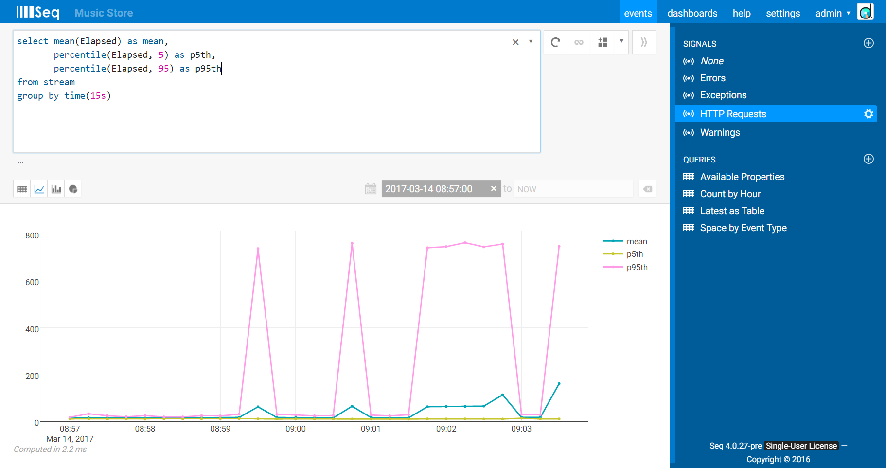
You might also track minimum (min()) and maximum (max()) timings. These values are good to know, but one or two very large points can seriously mess up the scale on this kind of chart. Depending on how things turn out for your data set, you might decide to track these in a separate chart. For the example we’ll stick with the mean, 5th and 95th percentiles.
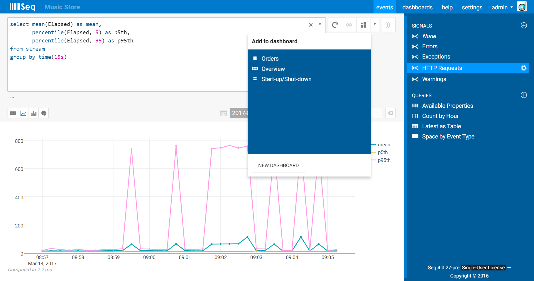
4. Add to dashboard
We’ve been looking at interactive query results up until now. Once you’re happy with how the data looks, use the new Add to dashboard button to save the chart. The box that appears will show you the dashboards already stored in Seq, and a button to create a new dashboard.
We’ll create a new dashboard called “Golden Signals”. The chart looks much like the interactive version we were just working with. You might need to choose a longer time period via the selector in the top right to see enough data.
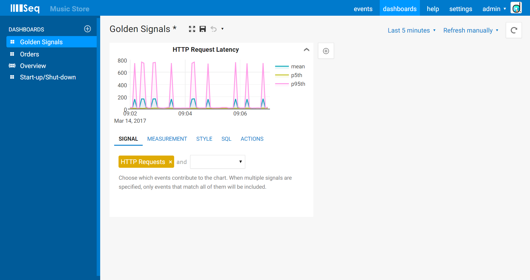
When expanded, the chart editor shows the signals that the chart is based on (our “HTTP Requests” signal from above), the measurement details, and some layout options (I like the fill to zero (y-axis) option and hide the point markers for this data set).
If you would like to share the dashboard with other people on your team, click the drop-down beside the dasboard name and choose Shared, before saving it. They’ll see it in the list when they visit the Dashboards screen, and you can send them the URL including the dashboard, range, refresh rate and other view settings.
5. Separate successful vs. failed requests
So far, the latency details have rolled up successful and failed requests into the same chart. The SRE book recommends tracking these separately - the behaviour of a successful vs. a failed operation will be quite different, making these quite different data sets.
Under Measurement in the chart editor, we could use the Group by clause to group values into succeeded and failed requests. We’re not short on screen real-estate though, so instead we’ll use the Where clause to limit one chart to sucessful requests, and create another limited to showing errors.
The clauses we’ll use are: StatusCode < 400 (succeeded), and StatusCode >= 400 (failed). Pop those into the chart editor:
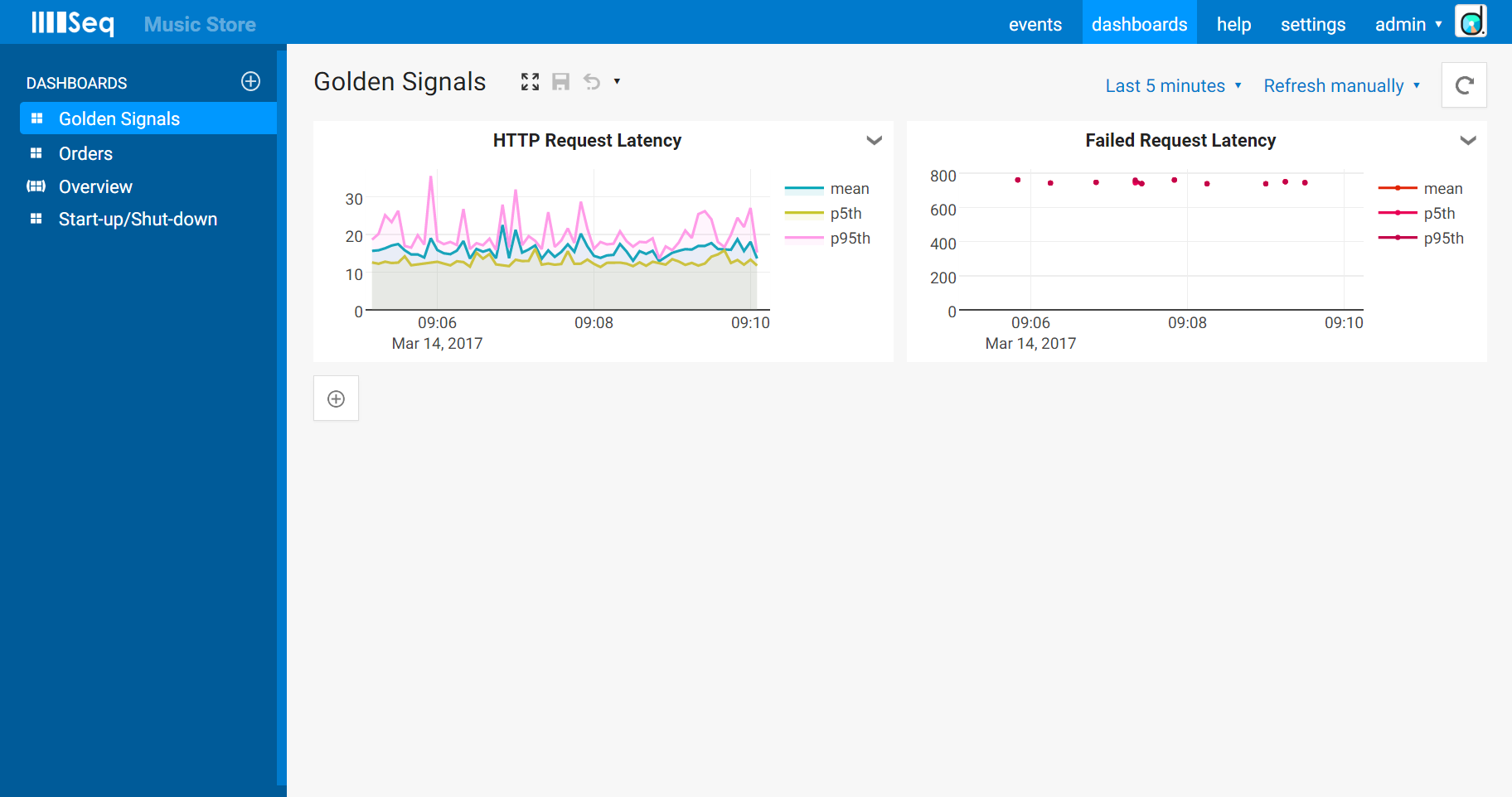
Since there’s very little data to show for failed requests, we might turn the point markers back on so that there’s something to see when only a few slices contain any values. I switched the error chart’s palette to Reds as well so that it stands out.
You might also choose to create individual charts for specific endpoints, by including the RequestPath in the Where clause, for example.
6. Drill down to investigate anomalies
It won’t be long before you see something interesting emerge from one or more of your dashboards. When you click on the chart area, you’ll switch back to the interactive Events screen. The query Seq generates when you do this will return the set of points at the time you clicked on.
Depending on what you’re interested in, you might refine the query further, or, to see the individual events, just remove everything except the contents of the where clause (if there is one). Seq will do this for you by default if the chart is only showing a count(*) measurement (just like clicking on the Seq 3.4 dash charts would do).
Conclusions
So, that’s the core of latency monitoring with Seq 4, and a pretty good end-to-end tour of how dashboarding fits into the picture.
You can dashboard anything you can write into a log event, with the monitoring data,and the application logs that tell the complete story, right there next to each other. I think it’s a sweet spot for many applications, and I’m looking foward to seeing Seq grow in this area. I’d love to hear what you think of the story so far!