Seq/2 Update
When I started building Seq nearly two years ago, I expected it would be used occasionally – after all, chasing bugs in production systems isn’t something we set out to do every day :-)
The first time I visited one of our larger customers on-site, I’d hoped to sneak a glimpse of someone using Seq as I walked through the office. I was in for a bit of a surprise; not only did I spot it running on nearly all developers’ “second” monitors, the QA team had a Seq session open and were collecting up exception information for a bug report when I passed by too!
Watching people use Seq, and using it myself, I’ve come to realize that effective instrumentation begins right up front during development, just like effective testing does. Using your logs during development is the only way to make sure they’re in tip-top shape for the occasional production (mis)adventure, and in the process you can get a much clearer picture of the inner workings of a system.
The net result is that many of us use Seq every day. That puts the bar for usability very high – when you spend a lot of time with an application, ergonomics really matter. Although there are literally thousands of opportunities to expand the product in its next major version, the first priority of Seq/2 is to make the user experience as delightful as it can be.

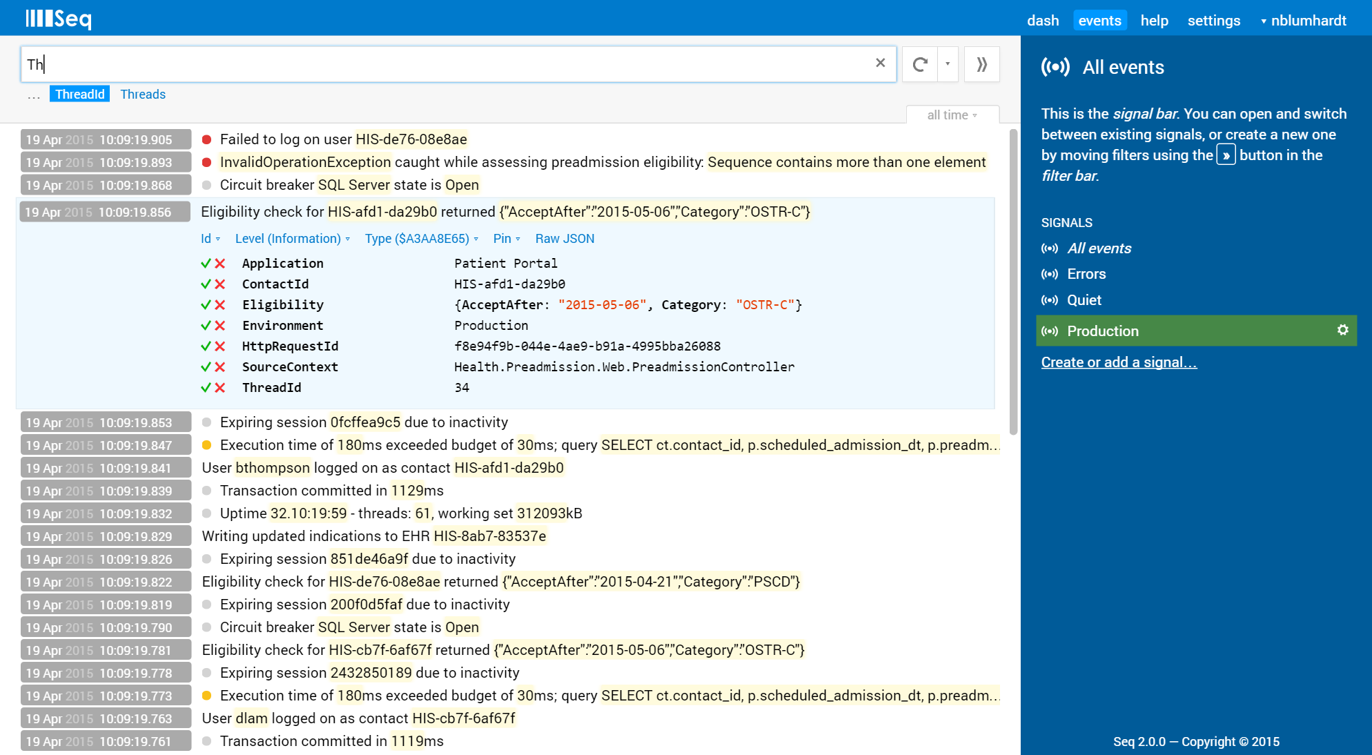
What does ‘delightful’ actually mean? We’ve reviewed and refined nearly every corner of the Seq user interface in the second version. On the events screen, where the “real work” gets done, you’ll find:
-
Queries and views are being merged into a single “signal” concept, which greatly simplifies working with them
-
Combining the filters from multiple signals is as easy as clicking each one to select it
-
Each user maintains their own view of the available signals in the system – signals created by other users are added explicitly
-
It’s easy to create a CSV export from all of the currently tagged properties
-
Property and built-in function names are auto-completed in the filter bar (ooooooh!)
-
Filter syntax help is shown under the filter box when an expression isn’t recognized
-
The interface is much friendlier towards touch devices
-
Date/time range selection is getting a big usability boost
-
Oh, and it’s now much easier to select text from log messages
Of these, we think signals are going to have the most impact; you can already see the simplifications they offer flowing through into the much cleaner (and now full-width!) filter bar. Many other changes are paving the way for exciting things we plan to introduce later in the 2.x series.
Work has been progressing steadily on the new version for several months, and we’re starting to get a better feel for the release date. If all goes smoothly we’ll ship a private alpha to interested users in the next month or so, followed by a public beta nearer the end of June. In the meantime I’m hoping I’ll have a chance to write more about the new version and what else you can expect from Seq this year.
If you’d like to participate in the 2.0 alpha, please sign up for the Seq newsletter via the footer of our homepage; we’ll be continuing to provide monthly updates through that channel. Cheers!
